《2019年流放经济学:流放之路》让我大吃一惊
2019-11-26
1336
当《流放之路》在2019年的ExileCon上首次发布时,我真的认为这是一个半开玩笑的玩笑,因为暴雪在一年前发布了《暗黑破坏神》。然而,当手机用户界面第一次出现在新西兰奥克兰奥提亚中心的视频中时,我就知道这是真的。同样值得庆幸的是,Chris Wilson和他的磨齿游戏团队已经准备好让玩家在那个周末的ExileCon上检查并提供反馈。那么流亡的经历如何转化为移动设备呢?
现在有很多游戏都在移动端取得了飞跃。最近几个月我们已经看到了《黑沙漠》的移动版,甚至《星战前夜》也加入了这一行动。但《流放之路》可能是少数几款能够提供适合移动平台的体验的游戏之一。它的游戏循环并不像《星战前夜》那样过于复杂,机制本身也是为手机体验而设计的。但结果如何呢?
相当不错,至少在这个早期阶段是这样,不过也不是没有改进的余地。
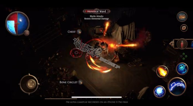
在视觉上,这看起来像路径,虽然视觉效果明显地削减了一些与PC版本。纹理真的会在小屏幕上弹出(我的游戏通关是在iPhone 11上),在小屏幕上给你的角色周围的世界提供所需的细节。你可以选择一个掠夺者,女巫或游骑兵,很像在表演地板上的流亡之路2演示,我决定与掠夺者一起去看看它是如何感觉接近行动。
移动被映射到屏幕左侧的一个虚拟的拇指棒上,幸运的是拇指棒是用你的手来跟踪的,这意味着如果你的手柄稍微移动一点,你不需要重新调整来控制——拇指棒会识别这一点并跟随你移动。我发现这非常有用,因为iPhone的后盖越来越热,所以我不断地调整手柄来弥补。
你的技能被映射到屏幕的右手边,有三个相当大的按钮可以使用——你的主要技能居中,比其他两个稍微大一点,以便更容易访问。在移动中,移动感觉就像流放之路的其他游戏一样——你在地图上探索,清除沿途的敌人,同时获取他们掉落的战利品。清洗和重复的方法。移动设备给人的感觉是一种合适的路径体验。
然而,也不是没有问题。我遇到的一个主要问题是一些UI元素没有应有的响应能力——特别是你的生命值和法力值。这是降级到菜单的右上角的屏幕-和我的斗争,特别是在激烈的战斗中充分打开这个菜单和选择正确的小瓶我需要。通常情况下它甚至不会打开拉出菜单-它只会消耗那里的所有烧瓶-所以如果我需要法力,但最近使用的烧瓶是健康,我发现自己愈合时,我不需要它。这真的需要更突出,更敏感,特别是考虑到治疗和补充法力在战斗中是多么重要。
库存屏幕减一点——你在库存没有那么多空间比你的电脑,我不知道这只是一个技术限制在移动端,或如果它是简单的用户界面在屏幕上的空间,但它确实感到限制。在一款全是关于收集战利品的游戏中,如果不能收集到更多的战利品就会感到有些尴尬。
然而,在很大程度上,移动是传统的路径。你将获得宝石,尽管不是在武器和盔甲上开槽,你将把它们放到技能屏幕上,让你的流放者获得下一轮敌人需要的技能。套接字系统也存在,允许你增加这些技能宝石与支持宝石,使他们更强大。
战斗本身感觉非常紧张——我的输入和我在屏幕上看到的大部分内容之间的反应令人难以置信。我确实注意到输入延迟和一些帧率问题,当所有的东西都在屏幕上,但这可以简单地归咎于它是和早期的建设,显然会有改进,优化的道路。
但是,伙计们,当你干掉一大群敌人,让他们的四肢在屏幕上飞来飞去,来回奔跑,每一个动作和攻击都比前一个更令人满意——这太有趣了。
作为一个不玩手机游戏的人,我甚至没有想过要玩手机游戏,但我却发现自己玩得很开心,这让我很惊讶。即使我手里的手机是核的,我也不想停止玩。我可以很容易地看到自己坐在床上玩流亡之路移动在睡觉之前,想清楚一个地图在我打盹。如果这可能是一个适当的执行路径的流亡经历,和磨削齿轮游戏历史上,没有任何迹象表明它不会被执行。
虽然还没有宣布手机版的发布日期,但我发现自己已经迫不及待地想再试一次手机版了。这很有趣,老实说,每当《磨齿游戏》发布另一个测试时,我都迫不及待地想再试一试——主要是因为我迫不及待地想看看它会发展到什么地步。如果我在最初的阶段有这么多的乐趣,我只能想象我的经验将如何改进和迭代基于ExileCon的反馈。
专业玩家网游戏工作室交流平台,集欧服,美服,韩服,台服,国服各种游戏资讯及游戏攻略方法,是游戏工作室首选门户网站。
原文:
Movement is mapped to a virtual thumbstick on the left hand side of the screen, and thankfully that thumstick tracks with your hand, meaning if your grip drifts a little bit you needn’t readjust to control - the thumbstick will recognize this and move with you. I found that incredibly helpful, as the back of the iPhone was getting so hot I was constantly adjusting my grip to compensate.
Your skills were mapped to the right hand side of the screen with three, rather large buttons to use - your main skill centered and slightly larger than the other two to make it more accessible. In motion, Mobile feels just like any other game of Path of Exile - you explore a map, taking out waves of enemies along the way, grabbing any loot they drop while doing so. Rinse and repeat. And Mobile feels like a proper Path experience.
However, it’s not without its issues. One of the major ones I encountered is some of the UI elements just aren’t as responsive as they should be - specifically your health and mana flasks. This was relegated to menu towards the middle-top of the right side of the screen - and I struggled, especially in the heat of combat to adequately open this menu and select the right vial I needed. Oftentimes it wouldn’t even open the pull out menu - it would just consume whatever flask was there - so if I needed Mana, but the most recently used flask was health, I found myself healing when I didn’t need it. This really needs to be more prominent, and responsive, especially considering how important healing and replenishing mana can be in the thick of a fight.
The inventory screen is pared back a bit - you don’t have as much space in your inventory than your PC counterpart, and I’m not sure if that’s just a tech limitation on the Mobile side, or if it’s simply the space of the UI on the screen, but it did feel limiting. In a game all about collecting loot, not being able to loot as much felt a little awkward.
However, for the most part Mobile is traditional Path. You’ll earn gems and, though instead of slotting in weapons and armor, you'll slot them into a skills screen to give your Exile the skills they need to take on the next round of enemies. The socket system is present as well, allowing you to augment these skill gems with support gems to make them more powerful.
Combat itself feels incredibly tight - and the responsiveness between my inputs and what I saw on screen for the most part was incredible.. I did notice input lag and some framerate issues when all of the things were going off on screen, but that can simply be blamed on it being and early build and there obviously will be improvements made to optimization down the road.
But man, when you take out a massive wave of enemies, sending limbs flying and racing back and forth across the screen, each movement and attack more satisfying than the last - it’s so much fun.
And as someone who doesn’t play mobile games, nor even really give them much thought, the fact that I was having as much fun as I was surprised me.. Even with the phone going nuclear in my hand, I didn’t want to stop playing. I could easily see myself sitting in bed playing Path of Exile Mobile before going to sleep, eager to clear one more map before I nod off. If executed well it can be a proper Path of Exile experience, and in Grinding Gears Games’s history, nothing suggests it won’t be executed well.
While no release date has been announced for Mobile, I’m actually finding myself chomping at the bit to get another go at the mobile build. It’s fun, and I honestly can’t wait to try it out again whenever Grinding Gear Games releases another test - mainly because I cannot wait to see where it goes from here. If I had this much fun at the earliest of stages, I can only imagine how my experience will be once it’s been improved and iterated on based on the feedback from ExileCon.
免责声明:部分内容转自其他媒体,转载目的在于为游戏工作室传递更多信息,如因作品内容、版权和其他问题请 联系客服